The font that you choose for your book is more important than you think. It contributes to creating a more compelling book that readers are drawn to. Your choice also says a lot about you as an author. Different fonts can look more credible and professional, while others look tacky and overused. We tend to find serif fonts, like Times New Roman, more believable than sans serif fonts, such as Comic Sans MS. It’s important that your book looks more convincing than the books next to it on the shelf.
Choosing the right font is also vital for readability. When looking at a book online or an e-book, sans serif fonts tend to be easier for us to read. But when we read a book on paper, it is much better to use a serif font for the body of the text. A combination of sans serif and serif can be used to make a book more interesting and easier for the reader. Using sans serif font for things such as title and chapter headings, but serif for the main text, will create a believable and visually appealing book for your buyer.
You might have some favorite fonts, but if they’re on the list below, DO NOT use them in your book! Here our a few of our least favorite fonts:
7. Arial
We don’t mind Arial as a font, but if you’re going for a simple look, use Helvetica instead. The real reason is that Arial is too overused. It’s everywhere! Simplicity is good but try something that is not seen in every magazine and newspaper in town. Find something original that fits with the style of your book.
6. Copperplate
The big argument we have against this familiar font is that it is capitalized. It would be impossible to write an entire book in a capitalized font and would make it very difficult for the reader. It could be used for the title or cover page but again, it is very familiar and a bit overused.
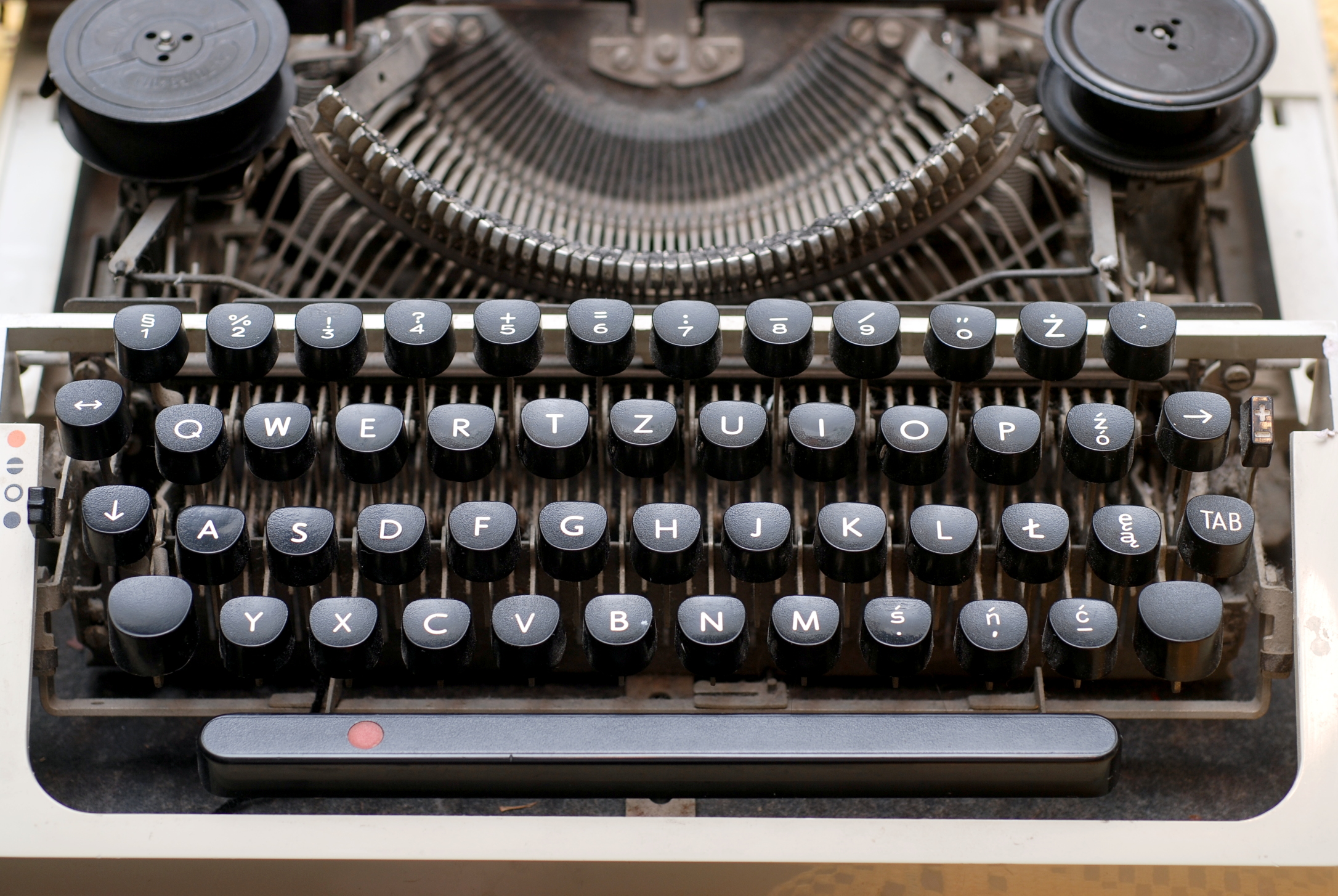
5. Courier New
This font was designed to resemble an old typewriter, which is useful for certain situations. But the body of a book is not one of them. Courier New and other typewriter fonts are not personal and read very plainly. The typewriter-style makes it somewhat difficult to read as well, because of the fluctuation between the letters.
4. Curlz
Curlz seems like the perfect font for a little girl’s 8th birthday party, but not for the chapter headings in your novel. It is not a formal font and should not be used in a serious setting. If you used this font in the body of your book, your reader would get some serious headaches.
3. Brush Script
Brush Script is one fancy font! It’s a wedding invitation, handwriting-style font that is not suitable for book text. It might look professional at first, but in reality it just looks cheesy and cheap. It is also somewhat difficult to read, especially when compared to a font such as Helvetica, which is extremely legible.
2. Papyrus
Unless you’re making a PowerPoint presentation on ancient Egypt, Papyrus is not the right font to use. Papyrus is often seen in tacky signs, advertisements, and commercials. It is strange to say that we hate a font, but we hate Papyrus. It’s kitschy and used far too often by those who think it looks professional.
Oh, Comic Sans MS. You poor, poor font. Comic Sans is the world’s most notorious font, yet it is still widely used. Do not use Comic Sans. Ever. It is childish and goofy, lacking all credibility. There isn’t anything particularly wrong with Comic Sans (it’s widely used for a reason) but there are very few situations in which it’s appropriate to use, and your book is not one of them. Comic Sans, like Curlz, is among the least professional and least serious fonts, and therefore would not be convincing in a book meant for adults.

Though we just spent all that time dissing these fonts, there is nothing especially wrong with any of them. They were all created for a reason but are often used in the wrong setting. Using these fonts in general is never a bad thing, but they do not have a place in your book.
Are there any fonts that you despise? Let us know some of your least favorites!
What’s with Calibri? Somehow CreateSpace converted one of my mss into Calibri automatically when I uploaded it. I had not heard of it before, nor recalled seeing it used in anything. Why would CreateSpace do such a thing?
We have no idea–do you mean your e-book? It might just be their standard font that you can change after uploading. Calibri is a nice font in word processing when you’re typing up manuscripts, but it’s too recognizable to print in a final book. E-books tend to use standard fonts, however.
More recent versions of Microsoft Office products brought in Calibri, Cambria, and Consolas for reasons that 100% escape me. It’s likely that CreateSpace didn’t have the font you used, so their copy of Word (or whatever they used) automatically substituted something “everyone has.” (Which is not true, of course, if you eschew Microsoft products!)
When dealing with publishers, the best advice is to use the fonts the publisher recommends. (I consider CreateSpace a publisher in this situation.)
Microsoft defaults to Calibri now – so that might be the culprit. No experience ( yet) with CreateSpace, so that’s the only comment I can offer…
What do you think about display fonts for chapter titles? My novel (girlinthejitterbugdress.com) is set in the 1940s and I have found fonts from that era and credit them in the back of the book. It this too much? Thanks.
Hmm–we’d have to see it, honestly. I like the idea, but it’s our belief that too much design with font choice overcomplicates the design! The sign of a great interior design is one you don’t notice–the words should speak for themselves.
I use comic sans for my childrens’ books. Yes it is childish, that’s why. Also create space has it as one of their recommendations.
BUT on the other hans I don’t have a love hate relationship with any font. They all good if they deliver my writings and thoughts to the readers.
Lea Thorbecke author of “Do I Look Like Breakfast”
Lea, I have done some picture book/videos on CD’s for relatives, and love using Comic Sans for those. There’s a place for everything – you know the saying, Never say never….
I agree with you that sans serif faces should not be used for body text, but not with your recommendation to use Helvetica instead or Arial because Arial is overused. Most readers are not typographers and are probably oblivious to the subtle differences among typefaces.
I would never use Arial for the body of a book, but I doubt that more than one tenth of one per cent of readers can tell it apart from Helvetica or any similar “swiss” typeface.
Michael N. Marcus
author of “The One Buck Indie Author’s Type Book”
http://www.amazon.com/dp/B00BD5IMII
http://www.BookMakingBlog.com
MIchael thanks for the comment. Looking forward to checking out your blog and checking out your book!
What do you think is the best font to use in a physical book? I’m going to be formatting my book for print in the very new future (if all goes according to plan,) and am unsure what direction I want to take. It’s fiction, NA genre, if that matters. I’m sure it probably does.
I’m always a fan of Garamond. That’s the best.
What about [New] Century Schoolbook?
There is no one answer, because fonts have two main aspects: readability (essential) and character. Even subtle differences can create a different feel on the page. You want one that’s sympathetic to the nature and style of your content.
Tim, you’re absolutely right. Couldn’t agree more. Thanks a ton for the comment.
Courier (old or Microsoft’s “new” ripoff) is good in a portion of a book or article that you specifically want to look like a typewriter for some reason. It should only be in short bursts, though, since proportional fonts “flow” better.
The only reason I’d agree with you about Arial is because Microsoft apparently threw it into the mix to avoid licensing Helvetica. (Yes, I know the two are different, but, as Michael Marcus said, the difference is subtle.)
When I started writing my fiction book several years ago, the advice I seemed to find everywhere was: always 12 pt and stay with something like Courier New, which I do. I am not especially fond of it; I like Calibri. Now I feel stuck with
Courier New.
Sintra, curious why you feel stuck with it? Are you just used to it? We’d encourage you to venture into using a font you’re more fond of.
I feel that I am stuck with Courier New because my entire manuscript, over 120K words is already in that type., and I am just now looking into getting it published. I would not know how to magically change it other than redoing the entire thing in a different font. Also, what I might esthetically like may not be the best choice for a horror themed novel. And what font would be suitable for a horror themed novel–
suggestions?
Sintra
See if this magic works.
Click anywhere in the type, hold down CTRL and the letter “a”. This will select all your type. Then change the font.
What do you think of Sanvito Pro for titles?
So what are the BEST fonts to use for the main body text of a book then?
I’m switching things up in my book. I wanted to use times new roman o(or helvica like you suggested) but for times where there are text messages or email, I want a more digital looking font like courier new or lucida sans cole
Typography is a subject more indie authors/publishers should consider, especially in an overall presentation of a book in its design–both interior and cover. Thank you for this post.
Offering a post from another designer’s perspective, “Book Cover Design and Typography 101” ( http://wp.me/p2nRQU-cg), first published Oct. 4, 2012, I hope to contribute another layer on the subject, one that I hope your readers will enjoy.
http://www.LorettaBoyerMcClellan.com
The book industry is so fickle and silly, and poorly paid. There are too many rules thrown around constantly for it to be such a poorly paid “profession”. Everybody is so sensitive & depressed in the writing “community”. It’s really not interesting. The more I research the writing & book industry, the more disappointed I am. It’s not impressive at all. And what’s up with the 1962 wages?
I’ve published seven books. My first consideration in choosing a font for the text block is readability. For that reason, a serif font is preferred. After that, I consider aesthetic appeal and consistency with the subject matter. Graphic designers are quick to disparage fonts like Arial or Times New Roman because they are “over used” or “obvious,” but both have their uses, and both are open and pleasant to read. Georgia, mentioned by Connie, is a favorite of mine, as is Arno and Garamond. I use the same criteria in choosing a font for a cover, plus distinctiveness for marketability, contrast with the cover color, and graphic design elements (illustrations, photographs, icons, etc.). For this, sans serif fonts are usually favored.
As for Anon’s observation that publishing doesn’t pay especially well, I would only note that it never has. There isn’t much money in publishing books; most books lose money. That is why NY publishers prefer genre books in fiction (sci-fi, detective, spy, fantasy, romance, soft porn, etc.) that they can sell to TV or Hollywood; they make more money in licensing fees than in book sales. Original plots and literary writing are discouraged. If they were fledgling writers today, luminaries such as Leo Tolstoy, Henry James, and Jane Austen would struggle to find a publisher for their best work, because the modern public lacks the ability to read and appreciate such works. At present, the big bucks flow to the electronic media, because that’s where the mass market is and the advertising dollar. For that same reason, serious authors and print designers (unless they have a well-known name) tend to work and publish regionally and make less money.
This is probably a huge no-no, but I used Georgia for the text of my books. It’s a big, somewhat rounded typeface. It was designed by Matthew Carter for Microsoft, and designed purposely to look good (and be easy to read) on a computer screen. However, what makes it look good on-screen makes it look good, um, on-page (in my opinion, anyway). Reading all the considerations that went into the design is interesting. In any case, it is a handsome typeface, and I intend to use it for all my print books.
Actual professional book designers with education and training in said profession can make great money, actually. That said, of course none of us would use fonts like these either for a book body—most of the typefaces you see publishers using in print don’t ship for free with your computer. It’s one of the advantages of design studios, I suppose—we have access to those sorts of resources. But I’d be wary of design advice received from bloggers without qualifications; you’re likely to end up with that infamous self-published look.