
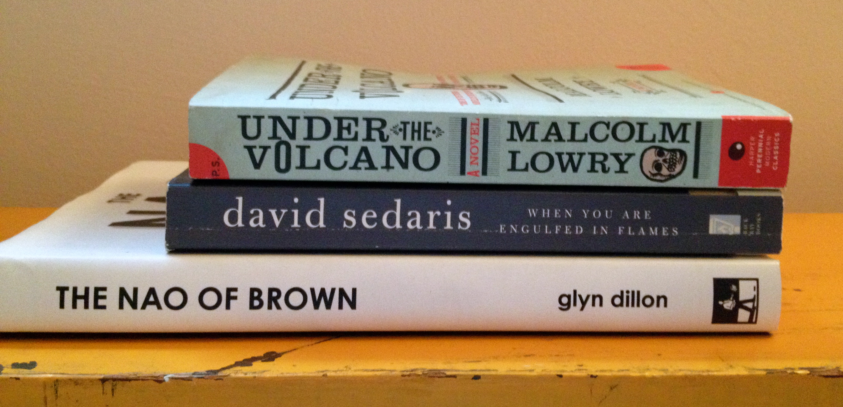
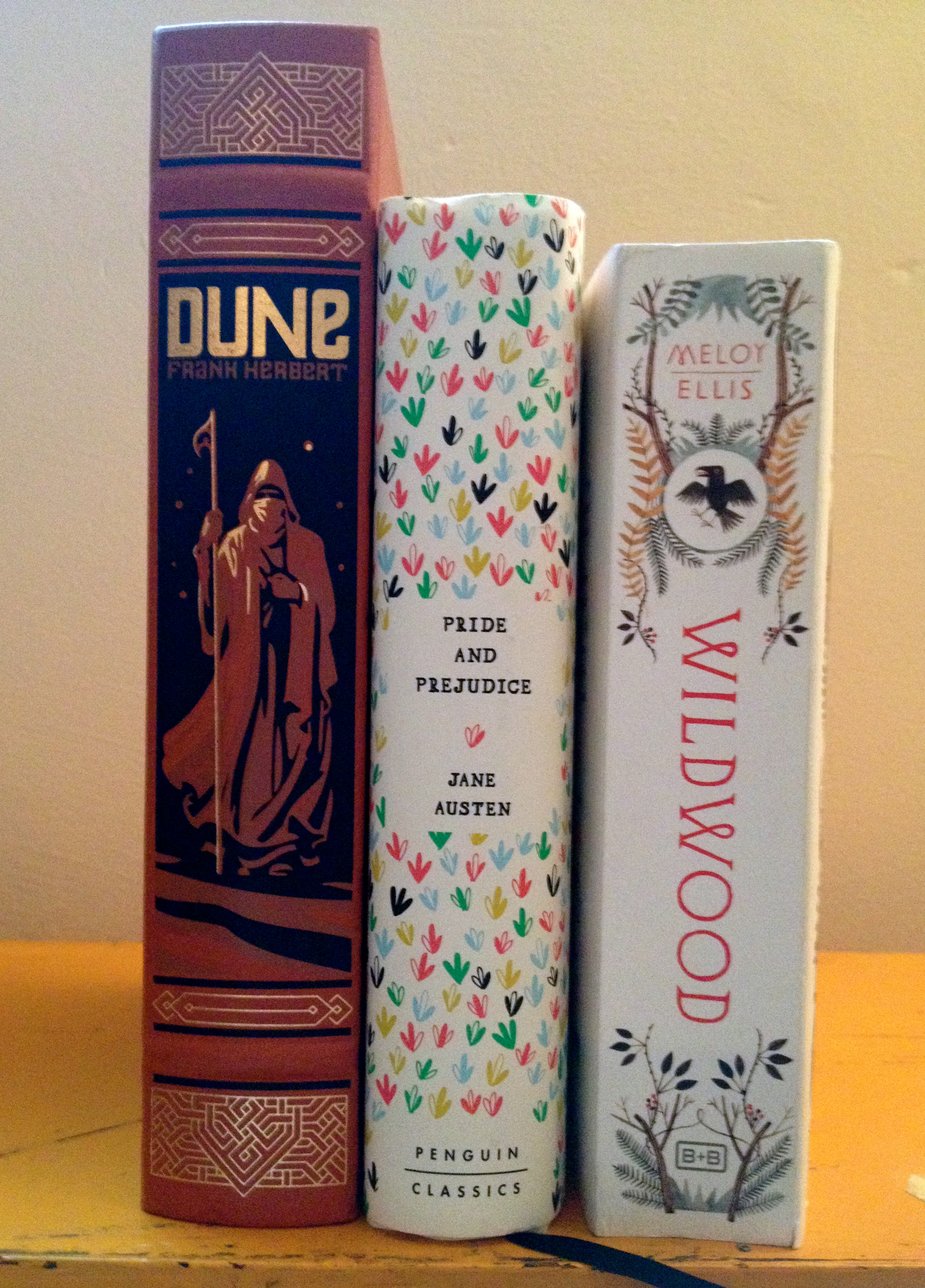
We already know how important your book cover design is, but could the spine be even more important? The spine is the first thing seen on a bookshelf in a store, library, or even in the home. Book covers may seal the deal, but the spine is what really draws the buyer in the first place.
The spine and book cover are used together in packaging your book. You want your cover and spine to be cohesive in design and image. The design of the spine should be interesting, and you should be able to hint at the genre of a book. You want your spine to stand out among the other books in its genre, and there are a few ways to do this.
1. Color is important!
You don’t want anything too gaudy, but you want a spine that is striking. This is especially important for thinner books. You don’t have much real estate, so you need to make the space count. The best way to do this is by using a bright color that is more noticeable than the 600-page monster sitting beside it.

Color themes are also important. Think about your audience and how you want them to feel when looking at your book. Different colors mean different things, and this could influence how your audience immediately sees your book.
While the colors you use are key, the contrast between the colors is even more important. The books that attract the most attention feature contrasting colors, such as a light font on a darker background, or vice versa. This is useful when marketing your book because the spine will be visible at a distance and close up. You want the spine of your book to pop out at a distance, making the buyer want to walk up and grab it off the shelf!
2. You need a proper font.
For the spine of a book, sans serif, blocky texts seem to stand out more than thin, serif fonts. While not always the case, it is generally advisable to avoid script fonts (or fonts that are difficult to read). Bold, simple text is even more important for thinner books. You don’t possess the same amount of space that bigger books have for graphics, so your text choice is particularly crucial!
3. Make it interesting!
This is the most important thing to think about designing your spine (and your cover). Your spine should be striking and interesting, but not too overwhelming. The spine of a book only needs the title, the author’s name, and maybe the logo of your publishing company, space-permitting. But if you have a bigger book, interesting and attractive images could make your spine look great. You want your home bookcase to look alluring and people only see the spines of books on a shelf.
Next time you walk by a bookshelf, take note of what spines jump out at you. What drew you in?
very good highlighters pertaining to book spine they certainly helped me paused for a moment in preparation for my innitial book.
thanks alot